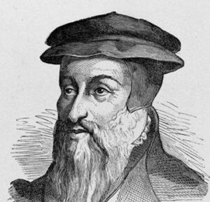
Training

Claude Garamont worked in Paris as an engraver, cutter, and type founder. Around 1530, he became an apprentice to Antoine Augereau, a young typographer established in Rue Saint-Jacques, who was among the first to make this activity independent from printing itself, since printers had previously engraved and cast their own type. Garamont completed his apprenticeship in 1534.
Around 1530, Robert Estienne, the renowned Parisian printer-publisher, commissioned from Claude Garamont a Roman typeface first used in the Paraphrasis in Elegantiarum Libros Laurentii Vallæ by Erasmus (1530). According to specialists, Garamont drew inspiration from the creations of Aldus Manutius and from the work of his own masters, Simon de Colines and Antoine Augereau.
In 1535–1536, Antoine Augereau was executed for heresy. Garamont was then employed as a type founder at the Soleil d’Or workshop, one of the largest printing houses in Paris, where he remained until 1540. He most probably completed his training under Simon de Colines, Robert Estienne’s father-in-law, who appears to have taken over part of Augereau’s activities, as he was a pioneer in introducing Roman and italic typefaces to Paris. It was also at the Soleil d’Or that Garamont became acquainted with Jean de Gagny, theologian, canon of the Sainte-Chapelle, collector of rare books, and personal chaplain to Francis I of France. Jean de Gagny took the young engraver under his protection and associated him with publishing projects in Greek and Roman type.
The Grecs du Roi

In 1539, Garamont was entrusted with equipping the printing house of Conrad Neobar, recently appointed “Printer to the King for Greek”.
In 1540, Garamont received the royal commission to create punches for a Greek alphabet, a task which occupied him for nearly ten years. He engraved for Robert Estienne (Printer to Francis I for Greek) three sizes of type, which were used from 1543 onwards in editions of the works of Xenophon.
To design these characters, later known as the “Grecs du Roi”, Garamont worked under the supervision of the Cretan master calligrapher Angelos Vergikios. These typefaces incorporated a large number of breathing marks, accents, and ligatures, making them aesthetically refined yet difficult to compose. They were employed by the “Printers to the King for Greek”, beginning with Robert Estienne, who later took the punches and matrices with him to his printing house in Geneva.
Publisher and Typographic Engraver
Between 1541 and 1543, Garamont and his brother-in-law Pierre Gaultier, both printers, settled at the Hôtel de Nesles, where Francis I intended to establish “a fine and great college, to be called the College of the Three Languages”, endowed with a royal library of Greek, Latin, and Hebrew manuscripts and dedicated to humanist learning. They were charged with creating a printing house associated with the future college, but the project was ultimately abandoned by the King.
Following the abandonment of the royal college project, Claude Garamont and his brother-in-law established themselves in the Latin Quarter. He then attempted to practice as a printer in partnership with Jean Barbé and Pierre Gaultier, thanks to the financial support of Jean de Gagny, but after two years the venture came to an end. He published around a dozen works, most of them in very small formats and chiefly reprints of religious texts in Latin: the Gospels, patristic treatises, works by modern theologians, and Christian poetry, both ancient and contemporary.
From 1550 onwards, Claude Garamont recut his Roman and especially his italic punches, the latter inspired by the typefaces of Simon de Colines. Jean de Gagny, Chancellor of the Sorbonne, advised him to create a new italic typeface, though it enjoyed little success.
Claude Garamont, Reformed Protestant
Garamont almost certainly embraced the Reformation, given his close connections with Protestant booksellers and publishers. Contrary to the custom of the time, his will invoked neither the Virgin Mary nor any saint. He requested simple funeral rites, attended only by a humble vicar, and ordered neither prayers nor masses after his death. His executor, André Wechel, openly declared his Protestant faith shortly afterwards. Following Garamont’s death in December 1561, Guillaume Le Bé and André Wechel purchased part of his equipment.
The Legacy of the Roman Typefaces
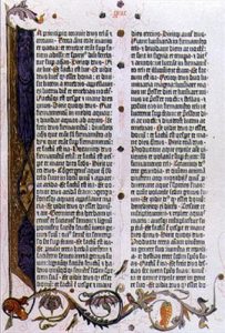
Garamont owes his fame to his Roman typefaces, whose quality was recognised throughout Europe during his lifetime and which rapidly supplanted the Gothic characters then in use. In 1600, Claude Garamont was listed among the “illustrious men since 1500” chosen by the printer Jean Le Clerc in a widely distributed broadside, alongside Robert Estienne and Christophe Plantin, “who immortalised their memory throughout the world by bringing the excellent art of printing to perfection”.
Although he did not invent Roman typefaces, Garamont brought them to an exceptional degree of refinement. Together with the italic types of Aldus Manutius, they became the preferred medium for the great wave of reprints of Latin authors during the Renaissance.
In the second half of the sixteenth century, the Le Bé foundry included Garamont’s finest typefaces in its catalogue, thereby preserving his memory. Although most of the matrices and punches were later acquired by Christophe Plantin of Antwerp and by Jacques Sabon of Frankfurt am Main, under Louis XIII the Royal Printing Office recovered the Garamont type held by the Le Bé foundry. These have been preserved at the Cabinet des Poinçons of the Imprimerie nationale since 1641.
Subsequently, Garamont’s typefaces fell into obscurity before being rediscovered and restored to prominence through the efforts of the Imprimerie nationale. In 1946, they were officially classified as historic monuments.
At the beginning of the nineteenth century, the neoclassical Didot style triumphed and Claude Garamont’s typefaces were abandoned. Yet around 1850, the Lyonnais printer Louis Perrin drew inspiration from Garamont’s work by commissioning typefaces that imitated those of the Renaissance; typographic signs created two centuries earlier were thus rehabilitated in their original form. The Imprimerie nationale began distributing ancient typefaces and, within only a few years, the fashion for “Garamond” spread throughout France, as well as to Germany, Great Britain, and the United States.
Today, Garamond remains the quintessential classical French typeface (the founder’s name is generally spelt with a “t”, while the style of typeface he created is spelt with a “d”). From the volumes of the Bibliothèque de la Pléiade to the Harry Potter books, in the press and in advertising, it appears across every medium. Yet this generic name encompasses a vast repertory of letters displaying an extraordinary diversity of form: more than two hundred digital typefaces today present themselves as “Garamond”.
See the presentation of the exhibition “From Garamont to Garamond(s): A Typographical Adventure” at the Mazarine Library in Paris.